
22 labeling examples worth stealing

Labels are one of those things you don't even notice in a store, until they're bad. But notice how differently you react to a candle with a holographic label catching the light, or a hot sauce with a die-cut label shaped like a chilli pepper? Or a supplement label with a raised, textured coating that feels different the second you pick up the bottle?
Good labeling isn't just a checklist of best practices. It takes creativity, and it becomes part of your brand whether you plan for that or not. Below are 23 labeling examples worth stealing, and who each one is actually good for.
1. Die-cut & shaped labels
A die-cut label is cut to the exact outline of your design, so the shape becomes part of the branding rather than a container for it. A chilli pepper for a hot sauce, a hexagon for a honey jar, a cloud for a children's snack.
It earns its cost when a product is competing hard for attention, at a farmers' market stall or in independent retail, and when the logo or icon is strong enough to work as a standalone silhouette.
See the format up close: die-cut labels
2. Transparent & clear labels
A clear label lets the product do the design work. Amber honey becomes the background color. A frosted glass candle lets the wax show through around the print.
Full color is possible with white ink behind it, or you can leave that off for a genuine see-through, no-label look, which tends to read as premium precisely because it looks like it has nothing to hide. Clear labels print on transparent vinyl either way.
See the format up close: clear labels
3. Bold graphics
Bold graphics stop someone mid-shelf-scan. That means real contrast, black on white or a vivid color against neutral, one dominant visual element rather than four competing ones, and thick, confident type rather than a thin serif that disappears at small sizes.
It doesn't have to be loud. One oversized illustration in black on cream is still bold if nothing else on the label fights it for attention. Done well, it gives you more control over how the product reads on shelf and helps differentiate products that would otherwise blur together. Works well on anything competing hard on a crowded shelf like hot sauce, craft beer, supplements.
4. Nostalgic & vintage-inspired labels
Retro labels borrow instant familiarity. Slab serifs or script type, aged cream and tobacco-brown tones, distressed edges, hand-drawn botanicals instead of vector icons. The eye already trusts what it recognizes.
Getting specific about the era sharpens it further, Victorian wood type reads as craft spirits, 1920s Art Deco reads as premium gin or chocolate. Mixing eras undercuts the effect, so pick one reference point and stay in it. Biodegradable paper gives it the most authentic, uncoated finish.
5. Minimalist & clean label design
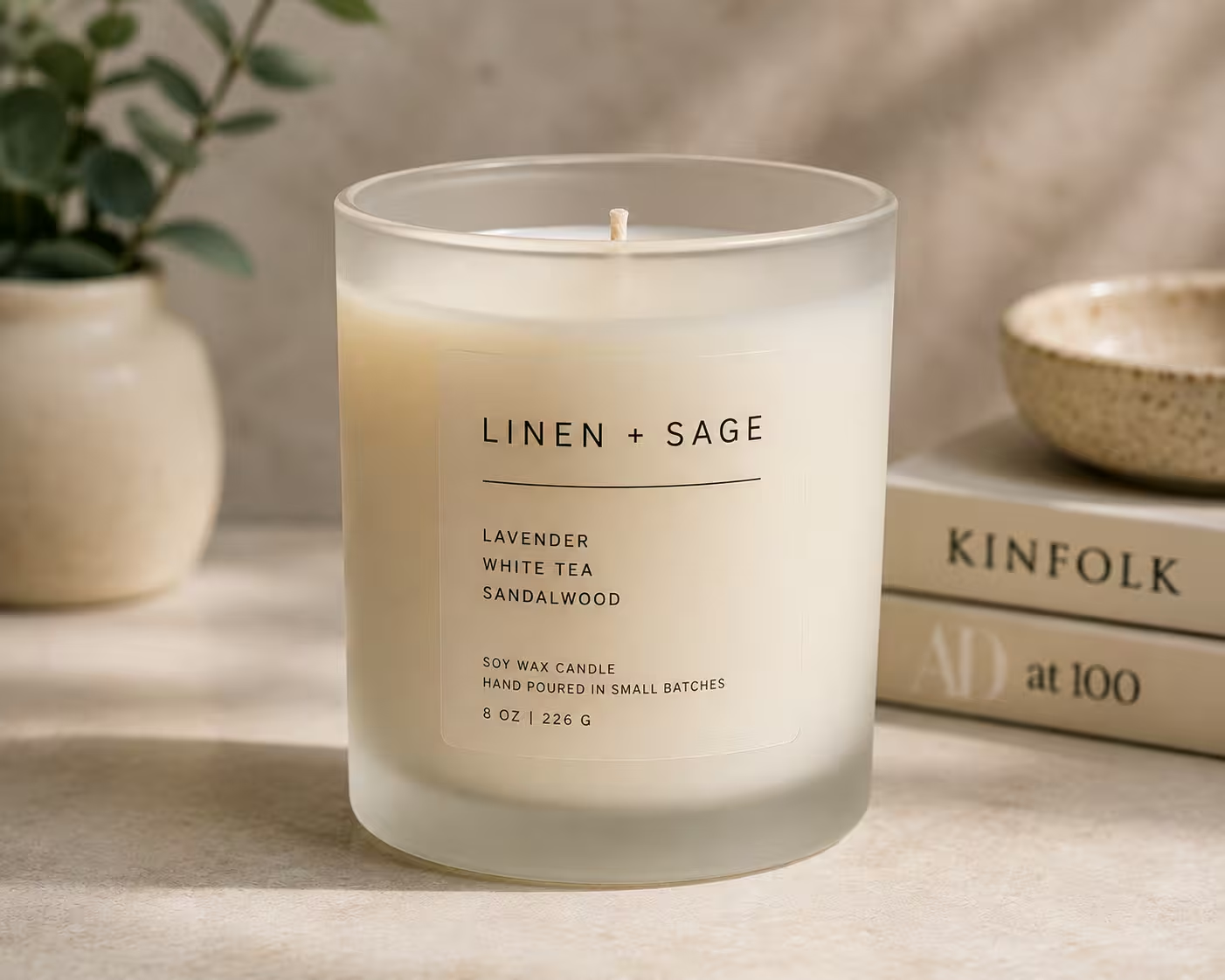
One typeface, one or two colors, generous white space, nothing decorative that isn't doing a job. It works because it signals confidence: a brand that strips its label back to essentials is telling the shopper the product speaks for itself. A good label doesn't need every trick in this list to work, sometimes restraint communicates a brand's values better than decoration would.
Best when the product itself is the visual, clear cold-brew bottles, olive oil, skincare serums. It's also less forgiving than it looks. A margin that's 2mm off, or one wrong font, reads as careless rather than considered.
6. Illustrated & hand-drawn artwork
A hand-drawn lemon on a lemonade bottle communicates fresh faster than the word "fresh" does, and illustration taps into emotions in a way a plain photo often can't. It also gives a small brand a consistent, ownable brand identity that doesn't need a studio, and over time it's one of the fastest routes to brand recognition on a busy shelf. Done consistently, it helps create a visual shorthand customers learn to spot instantly.
Line art suits artisan food and herbal teas, botanical illustration suits gin and candles, character-based illustration suits children's or pet products. Pick one style and apply it consistently across the whole range. Matt finish tends to suit illustration better than gloss, since the ink sits softer.
7. Typography-led labels
A label can carry its whole design on type alone, no illustration, no photography, as long as the font pairing and spacing are deliberate. A large display font for the name against a small, light font for the description creates hierarchy without adding elements.
Wide letter spacing on uppercase reads as premium. Hand-lettered, drawn-not-typed styles signal craft. A single short phrase, well set, can do more work here than a paragraph of copy. It suits products where the name itself is the statement, a distinctively named spirit, a candle with a poetic scent description.
8. Bold color palettes
Most shelves default to white, beige, or black packaging, so a label in coral, electric blue, or bright yellow gets noticed before it's even read. The trick is one hero color the whole design anchors to, with a complementary neutral so the eye has somewhere to rest.
Consistent use of color-coding across a range, green for mint, red for cherry, lets consumers navigate variants at a glance without reading a word, reinforces a positive impression, and it's a small but real driver of brand loyalty once people learn the system. Holographic is worth a look for multi-variant ranges, since it shifts colour under different lighting rather than sitting flat.
9. Foil stamped details
Foil adds a metallic layer to one specific part of a label, a logo, a name, a border, that catches light and reads as premium instantly. It doesn't need to cover the whole label; a small gold-foil logo on black matte is often more striking than foil everywhere.
Beyond gold and silver, the label world runs to copper, rose gold, and holographic foil that shifts color as it catches light. Both gold and silver foil print on a waterproof clear base.
10. Luxury metallic & glitter effects
Metallic and glitter finishes read as premium before anyone reads the label itself. Mirror gold and mirror silver vinyl reflect like actual chrome rather than just catching light, holding that finish for up to a year outdoors.
Glitter sparkle is sealed under a gloss laminate, so it's dishwasher-safe rather than loose particles that flake off. Both need white ink behind the design to keep colors flat and opaque, or you can skip that step and let the metallic base show through instead.
Browse the full range: glitter labels
11. Textured & tactile finishes
Texture changes how a product feels in the hand before anyone reads a word. A soft-touch matte laminate resists fingerprints and adds a slightly plush feel. A high-build coating sits raised enough that it can't be flattened by hand, good for highlighting one element rather than the whole label.
The paper's fine ribbing suits wine and spirits, uncoated kraft suits zero-waste brands, cotton rag suits luxury candles. It's most convincing when it backs up the product, a soft-touch matte makes sense on natural skincare, not on an industrial adhesive.
12. Color-reactive inks
Some specialty inks respond to a real-world trigger instead of sitting flat on the label. Thermochromic ink shifts color at a set temperature, reversibly or permanently, useful as a hidden message or a visual cue that a drink has hit serving temperature.
Chameleon ink shifts color depending on the angle you view it from. Sunlight-reactive ink stays invisible indoors and reveals a colour change the moment it hits direct sun, which suits a limited edition built around a reveal. All three work best as one surprise element, not the whole label.
13. Glow-in-the-dark & blacklight effects
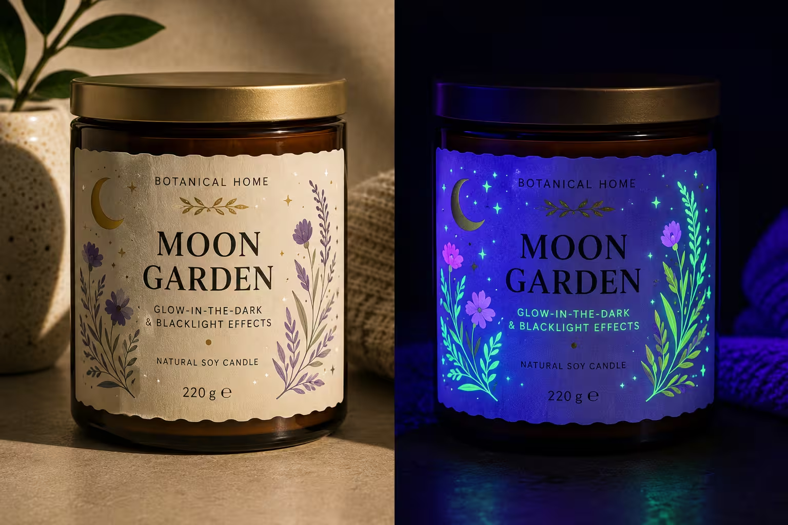
True glow-in-the-dark ink absorbs light and releases it slowly once the room goes dark, which works best on one specific design element rather than the whole label, a logo, an icon, a hidden message.
Blacklight-reactive ink is a different trick entirely: invisible in normal light, then fluorescing under UV. Both suit products sold somewhere the lighting itself is part of the experience, festivals, bars, a Halloween run. Best treated as a limited or seasonal effect, since the novelty is what sells it.
14. Eco-friendly materials
Sustainability credentials are increasingly important to shoppers, and Sticker It's eco-friendly range answers that with Natureflex, a wood-pulp film with a compostable adhesive that breaks down in about 12 weeks alongside food waste. Worth being upfront about the one real trade-off: it isn't waterproof, so it holds up better in stable, indoor environmental conditions than anything exposed to damp or direct sun.
The separate biodegradable paper option, made mostly from sugarcane fiber, is splashproof but not fully waterproof either. The adhesive matters as much as the film, since a compostable label with a petroleum-based glue defeats the point.
See the format up close: eco-friendly range
15. Interactive & multi-sensory labels
Scratch-reveal panels hiding a code or a short message, peel-back layers exposing a recipe, and scent-release ink that lets a scratch or a rub trigger a specific fragrance all extend a label past the point of purchase into something a customer actively does something with.
A printed marker that triggers a photo-based digital experience does the same job through a phone camera instead of a fingernail. It only works when the interaction earns its place, a gin label revealing a cocktail recipe makes sense. Novelty for its own sake reads as gimmicky fast.
16. QR codes and digital links
A QR code connects a physical label to a digital destination, a recipe, tasting notes, a how-to-use video, without adding more text to the label itself. Placement matters more than people expect. It shouldn't compete with the main design.
Most brands tuck it into a corner or move it to the back label entirely, with one short line explaining what it links to. Use a dynamic code rather than a static one and the destination can be updated any time without reprinting a single label.
17. Full-wrap labels
A wrap covers the full circumference of a bottle or jar instead of a small front panel, which matters for descriptive labels carrying a lot of detailed information: supplements, allergen declarations, a full nutritional panel. It gives essential information and other product details room to breathe instead of being crammed into a corner.
The front carries the brand design; the sides and back carry the compliance copy, and the result looks more finished than a front sticker with bare glass showing round the sides. The one thing to get right is the seam, where the two ends meet.
18. Reverse printing
Reverse printing means printing on the back of a clear label instead of the front, so the design sits protected behind the material rather than exposed on top of it. It only works on a genuinely transparent surface, applied to glass or clear plastic, since the viewer needs to see through the container to read what's printed on the label's underside.
It's a clever way to add extra detail without cluttering the visible face, a second layer of information that only shows up on close inspection, or a hidden message revealed as a product empties. Works best paired with clear labels on a genuinely see-through container.
19. Linerless labels
A linerless label skips the paper backing altogether. Instead of peeling a label off a release liner, the adhesive is protected by a coating on the label's own front surface, so one roll holds more labels in the same space with no backing paper left over.
It suits high-volume, machine-applied runs more than small manual batches, since it needs compatible dispensing equipment to apply cleanly. The appeal is mostly practical: less material waste per label, and nothing to peel off and bin on the production line.
20. Static cling & removable labels
Static cling labels use no glue at all. They stay on smooth, non-porous surfaces like glass through static and light suction, which means they come off clean and can be repositioned as many times as you like.
That makes them the right call for anything temporary: a seasonal window display, promotional labels advertising special deals, a label a customer might want to remove and reapply themselves. Nothing underneath gets damaged, and there's zero adhesive residue left behind once it's peeled away.
21. Heavy duty & industrial labels
Standard labels can peel, fade, or fall off in rough conditions, and some products need to survive worse than a kitchen shelf. A heavy duty laminate runs around eight times thicker than a standard label, backed by an adhesive built to hold through scraping, temperature swings, and constant handling through a rough supply chain.
It's the right choice for machinery, tools, outdoor equipment, and anything that gets handled roughly rather than displayed carefully. Not the prettiest option on this list, but by far the toughest.
See the format up close: heavy duty labels
22. Compliance-ready & informational labels
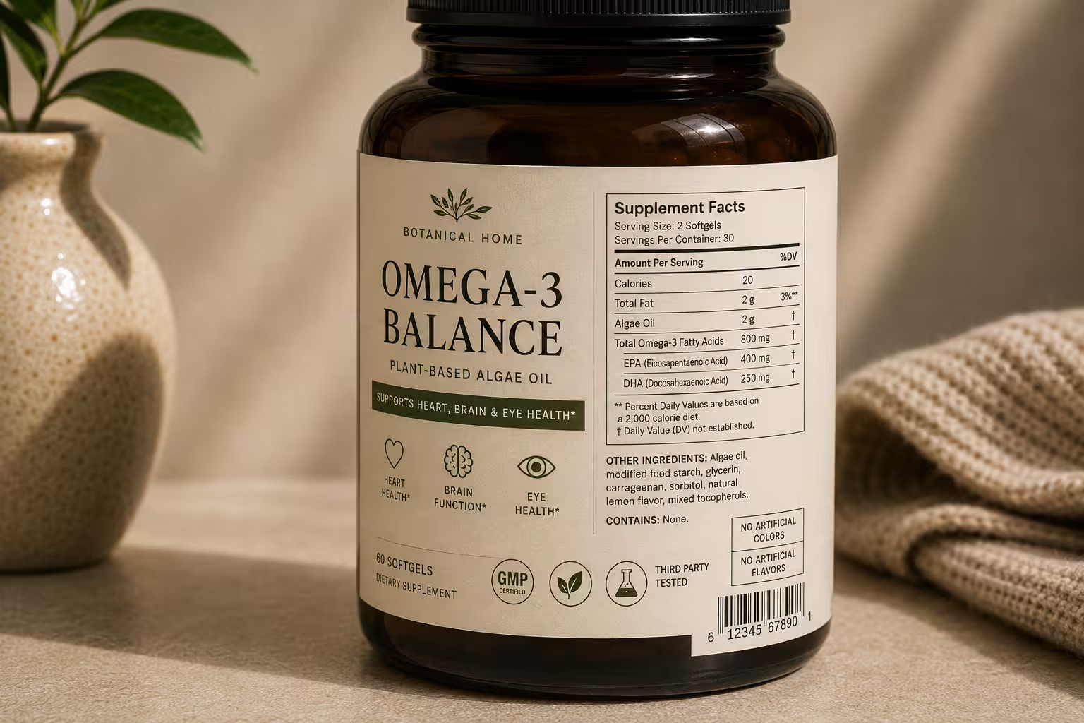
Some products carry a legal minimum before they carry a design. Ingredient lists. Allergen and dietary restriction call-outs. Dosage or usage instructions. Safety warnings. Food, supplement, and pharmaceutical-adjacent products need labels built around exact regulatory compliance, not just the boldest visual on the shelf. For food items especially, meeting legal requirements comes before a single color gets chosen.
That doesn't rule out good design. A dedicated panel, or a full-wrap layout, gives the required copy its own clean, legible space. The primary panel can still lead with color, type, or illustration.
Get the hierarchy right. Make the mandatory text readable at a glance. Let the brand story do the persuading. Do that, and the label does two jobs at once: it keeps consumers informed and it still looks good on shelf.
Final thoughts
Whatever the product, whether you're printing one-off brand labels or a full range, the job stays the same. You have to capture attention, build consumer trust, and earn the sale.
Ready to see it on your own product? Order a sample pack or start designing your custom labels with Sticker it.
FAQs
Do all product labels need to include regulatory or compliance information?
Not every label carries the same legal load. A candle or a piece of merch has far fewer requirements than a food, supplement, or cosmetic product, where regulatory compliance can dictate exact wording for ingredients, allergens, and safety warnings. For food items in particular, providing essential information isn't optional. Check the rules for your specific product category before finalizing layout, since requirements vary by industry and by country.
How do I fit safety warnings and usage instructions without ruining the design?
Give the mandatory copy its own space rather than squeezing it into gaps around the brand design. A full-wrap label or a dedicated back panel keeps consumer safety information legible while the front panel still does the branding work. Trying to blend the two usually makes both worse, and a cramped warning can create a negative impression even when the product itself is fine.
What's the difference between a decorative label and an informational one?
A decorative label's main job is to grab attention and build brand identity, color, shape, finish. An informational label's main job is to communicate essential information clearly, ingredients, dietary restrictions, dosage, usage instructions. Most real-world products need both, just usually on different panels of the same label.
Do labeling requirements differ for food, supplements, and pharmaceutical products?
Yes. Food labeling typically centers on ingredients, allergens, and nutritional information. Supplement and pharmaceutical-adjacent products usually carry stricter rules around dosage, warnings, and claims, and pharmaceutical industries in particular are subject to close regulatory oversight. Always confirm current requirements with the relevant regulatory body for your market rather than relying on a competitor's label as a template.
Can a compliance-heavy label still support brand identity?
Yes, through hierarchy rather than compromise. Keep the legally required text in a clean, readable block, and let the rest of the label, color, illustration, type, do the branding. A full-wrap format or a clearly separated back panel is usually the easiest way to keep both working without one undercutting the other.
Subscribe to our newsletter
Enter your email below to stay up to date on Sticker it's latest, including new product launches, exclusive deals and more.